Dashboards
Dashboards are the place where individual charts become a shared operational view. Dashboards reuse the charts you already created in Charts and arrange them into one screen for monitoring, analysis, or presentation.
That design is important because it keeps the responsibilities clear. A chart answers one analytical question well. A dashboard combines several of those answers so a user can understand a machine, a line, or a whole process at a glance.
Dashboard Overview and Runtime
Dashboard Overview
Dashboard
Before you build a dashboard
Dashboards depend on existing charts. They do not start from raw data, and they do not replace the chart editor. That means the best dashboards are usually built from charts that have already been validated carefully: the dataset is correct, the query makes sense, and the visualization already communicates something useful on its own.
If no charts exist yet, the dashboard editor will simply show an empty chart-selection state. This is not a limitation so much as a design principle. It keeps dashboards focused on composition and monitoring instead of turning them into a second chart-builder.
Understand the current dashboard model
The central idea is that each dashboard item references a saved chart. A dashboard therefore does not duplicate the data logic of that chart. It embeds and reuses it.
This has practical advantages. One chart can be reused in several dashboards. A change to the chart definition improves every place where that chart is used. And the dashboard itself stays easier to maintain because it is concerned mainly with layout, time coordination, visibility, and operational context.
A good example is a compressor temperature chart. That same chart can be useful in an asset-specific dashboard, a maintenance dashboard, and a broader operations dashboard. The query does not need to be rebuilt three times. Only the surrounding context changes.
Start from the dashboard overview
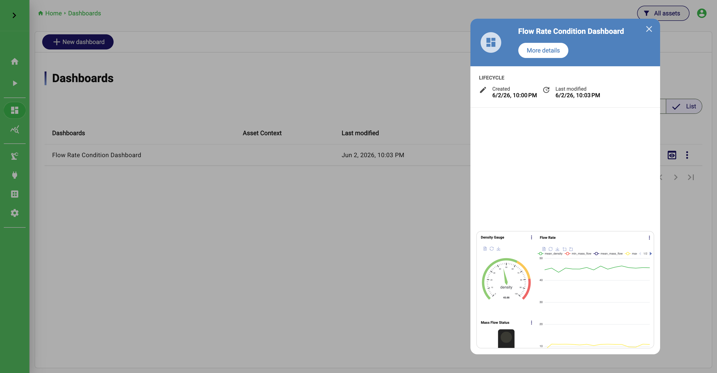
Open Dashboards to reach the overview. This is the place where you manage existing dashboards and decide whether you want to open, edit, copy, or share one.
Each dashboard entry can be opened directly, and the action menu provides the most important operations: Show, Edit, Clone, Kiosk mode, Settings, Manage permissions, and Delete. The overview also shows basic metadata such as the dashboard name, description, creation date, last modification date, and asset context when assets are used.
From a documentation perspective, it helps to think of the overview as the management layer and the dashboard panel as the runtime layer. The overview is for deciding which dashboard you want to work with. The panel is where the dashboard actually lives.
Create the dashboard shell first
To create a dashboard, open Dashboards and click New dashboard. Before you place any charts, StreamPipes opens the dashboard settings dialog. This is the moment where you define what kind of screen the dashboard is supposed to become.
The settings dialog starts with the obvious fields: Dashboard title and Description. Those matter more than they sometimes seem to. A dashboard is often consumed by users who did not build it, so a clear title and short description help set expectations immediately.
From there, the more structural decisions follow: Default view mode, Grid columns, Grid row height (px), Use global time settings instead of chart time settings, and Hide chart toolboxes in this dashboard. If you have asset permissions, you can also add the dashboard to an existing asset directly from this dialog.
[Image placeholder: dashboard settings dialog with title, description, view mode, grid configuration, global time, toolbox setting, and asset link option]
Decide how the dashboard should be read
One of the first meaningful choices is the default view mode. StreamPipes currently supports Grid view and Slide view, and they correspond to two different reading experiences.
Grid view is the familiar operational dashboard. Several charts are visible at once, and the viewer can compare them side by side. This is the right mode when correlation matters. A production-line dashboard, for example, may show throughput, energy, alarms, and machine status together because the viewer should be able to connect those signals quickly.
Slide view changes that reading pattern. Instead of showing many charts simultaneously, it presents them one at a time. This is useful when screen space is limited, when each chart deserves more space, or when the dashboard is intended for sequential presentation rather than parallel monitoring. A meeting-room screen or a narrow kiosk display is often a better fit for slides than for a dense grid.
Neither mode is inherently better. The better mode is the one that matches the audience and the screen. If users need cross-comparison, use grid view. If they need focus and readability, slide view is often the better choice.
Shape the layout to the screen
The layout settings, especially Grid columns and Grid row height (px), are what make the dashboard feel appropriate for its target display.
More columns allow denser horizontal placement. A larger row height gives charts more vertical room and often improves readability for larger trend views. This is not just cosmetic tuning. It changes whether a dashboard feels like a cramped collection of cards or a deliberate operational screen.
When deciding these values, think about the actual environment in which the dashboard will be used. A wallboard for a production area needs different proportions than a desktop dashboard used by an engineer. A dashboard full of compact KPI tiles benefits from a different grid than one that contains two or three large trend charts.
Decide whether time should be shared
The setting Use global time settings instead of chart time settings is one of the most important design choices in the entire dashboard.
When global time is enabled, the dashboard behaves like one coordinated analytical view. All charts follow the same time window, and the toolbar can expose one shared time selector for the whole screen. This is often what users expect from a shift dashboard or an operations dashboard. They want all charts to answer the same time-scoped question.
When global time is disabled, each dashboard item can keep the time settings of its saved chart. This is useful when the dashboard intentionally mixes horizons. One chart might show the last 15 minutes of alarms, another the last 24 hours of throughput, and another the last 7 days of energy consumption. In that case, a single shared time range would actually reduce clarity.
The rule of thumb is simple: if the dashboard is meant to tell one coordinated story about one time window, use global time. If the dashboard is meant to combine short-term and long-term views intentionally, keep chart-level time.
Decide how much chart-level UI should remain visible
The option Hide chart toolboxes in this dashboard determines whether the embedded charts keep their own toolboxes when viewed inside the dashboard.
This has a strong effect on the feel of the final screen. Leaving the toolboxes visible makes the dashboard more interactive and locally inspectable. Hiding them makes it calmer and more presentation-oriented. For operator displays, wallboards, and kiosk-style screens, hiding the toolboxes is often the cleaner choice. For engineering or analysis workstations, keeping them visible may be more helpful.
Add the dashboard to an asset when context matters
If assets are used in your installation and you have the right permissions, the settings dialog lets you attach the dashboard to an existing asset. This is valuable when the dashboard belongs clearly to one machine, one line, one site, or one equipment hierarchy.
Attaching the dashboard to an asset is not just an organizational detail. It changes how users discover the dashboard. Instead of navigating to it only from the dashboard overview, they can also reach it from the asset context where it often makes more sense operationally.
Open the dashboard and understand the panel
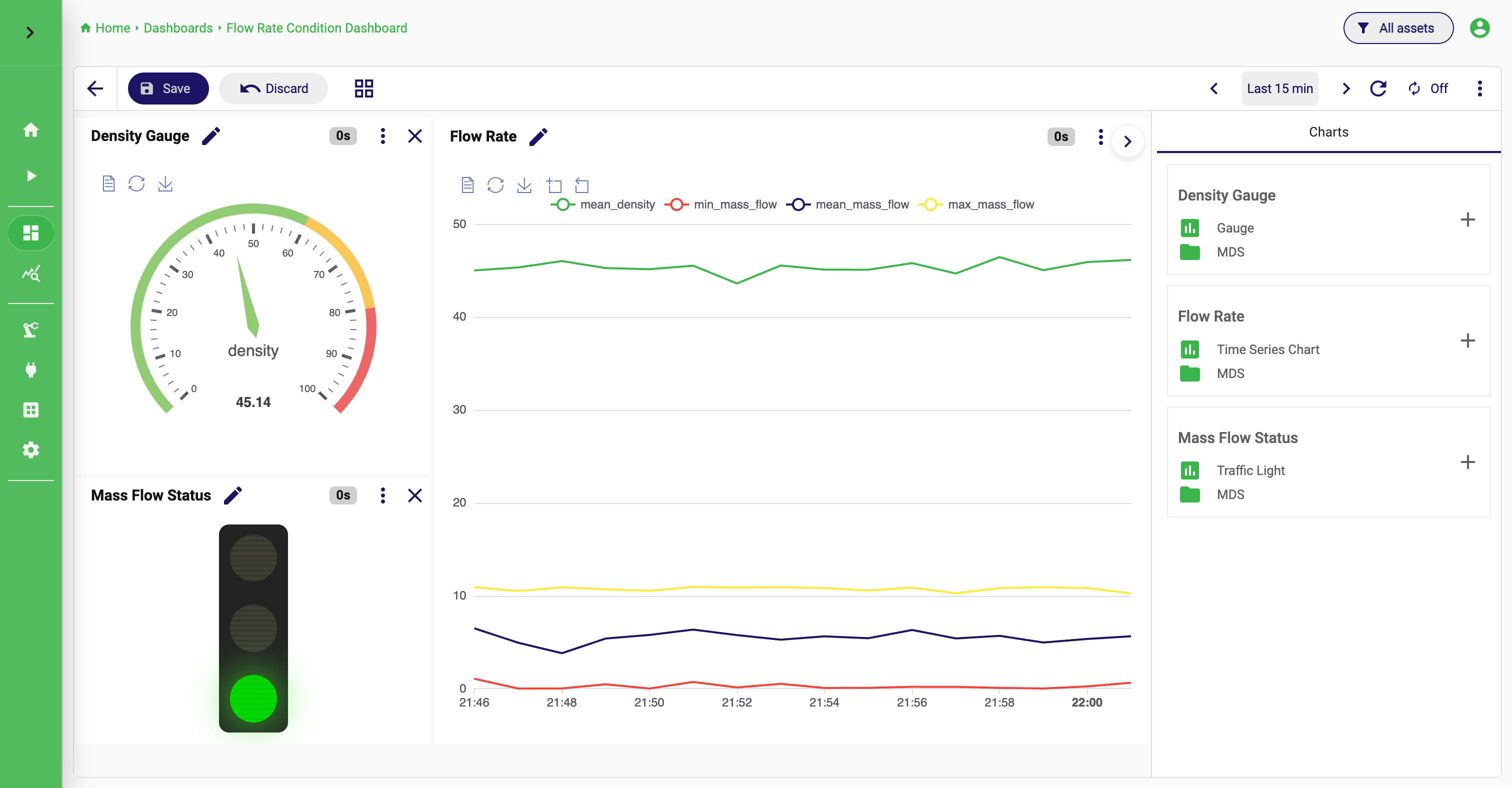
Once created, a dashboard opens in the dashboard panel. This is the runtime surface where the charts are actually shown and where most users will spend their time.
The toolbar is small, but it defines how the dashboard behaves. In edit mode, it shows Save and Discard. In both edit and view mode, it lets you switch between Grid and Slides. If global time is enabled, it can show the shared time selector. It also provides access to the dashboard live refresh settings and an options menu for actions such as Edit dashboard, showing or hiding the time selector, and deleting the dashboard.
This split between the panel and the settings dialog is useful. Settings define what the dashboard should be. The panel is where users experience that decision in practice.
Compose the Dashboard
Move into edit mode when the composition should change
To change the content or layout of a dashboard, open it and switch into edit mode. You can do that either from the overview or from the dashboard panel itself through the options menu.
In edit mode, the dashboard becomes a composition surface. The toolbar exposes Save and Discard, and the right-side chart-selection panel becomes available. This is the current mechanism for building the dashboard body.
The panel itself is intentionally simple. It lists the saved charts that can be reused. If the panel is collapsed, expand it first. Then browse the chart list and add the chart you want to place on the dashboard. When you do this, StreamPipes creates a dashboard item that points to the existing chart. The chart is not copied into the dashboard as a separate analytical object.
That detail matters because it explains how to maintain dashboards later. If a chart’s logic needs to change, the right fix is usually to update the chart, not to treat the dashboard item as an isolated object.
Think of dashboard design as composition, not recreation
When adding charts, resist the temptation to use the dashboard as a place to “finish” unfinished chart work. A dashboard works best when each included chart is already strong on its own. The dashboard then becomes a composition task: deciding which charts belong together, how large each one should be, and what sequence or spatial arrangement makes the operational story easiest to read.
In Grid view, this means arranging the dashboard so the most important relationships become obvious. A large trend chart with smaller KPI or status charts around it is often effective. So is a left-to-right flow that follows the physical process. The right layout depends on the mental model you want the user to apply in a few seconds.
If a chart should no longer appear in the dashboard, removing it only removes the dashboard item. The underlying chart still exists in Charts. This is an important distinction. Changing the dashboard layout is not the same as deleting the reusable analytical building block.
Use slide view deliberately
When the dashboard is shown in Slide view, the reading experience changes from comparison to sequence. One chart is visible at a time, and the viewer moves through the set of dashboard items more like a presentation.
This is especially useful when the audience should focus on each chart individually or when the display area is too limited for several charts to stay readable at once. A narrow screen in a meeting room, a presentation monitor, or a kiosk-oriented installation can all benefit from this mode.
The key is to use it intentionally. If users need to compare charts against each other constantly, slide view will frustrate them. If they need one chart at a time with maximum readability, it can be the better experience.
Coordinate time and refresh in real operation
Dashboards are not only about layout. They also add an operational layer on top of charts through shared time handling and live refresh behavior.
If global time is enabled, the toolbar can expose one time selector for the whole dashboard. This allows the viewer to change the time window once and immediately see every chart update into the same context. This is one of the most powerful reasons to use a dashboard instead of opening several charts separately.
The options menu can also show or hide the time selector. This sounds minor, but it matters on large displays. A wallboard that should remain visually quiet may benefit from hiding it. A working dashboard used interactively by engineers may benefit from keeping it visible all the time.
Live refresh is the other operational dimension. Dashboards often remain open for long periods, especially on operations screens. In those cases, automatic refresh is part of the dashboard’s usefulness, not an afterthought. A dashboard that never refreshes is more like a report. A dashboard that updates steadily is closer to a monitoring surface.
Save, clone, share, and present
When you save a dashboard, StreamPipes stores the selected charts, the current layout, the chosen view mode, and the dashboard-level settings such as global time and toolbox visibility. Saving therefore preserves both structure and behavior.
Cloning is useful when the current dashboard is almost right for another machine, line, or site. Instead of rebuilding it, you create a copy and change only the few charts or settings that differ. This is one of the easiest ways to build a consistent dashboard family across similar assets or production units.
Permissions matter when a dashboard should be available only to certain teams, roles, or groups. This is often the right approach when the underlying charts may be broadly reusable, but the assembled dashboard should remain specific to one audience.
Kiosk mode is best understood as a presentation-focused runtime option. Use it when the dashboard is meant for a screen that is observed rather than actively operated.
How dashboards fit into the wider workflow
Charts and dashboards are tightly related, but they solve different problems. A chart answers one analytical question well. A dashboard combines several saved charts into one operational context. This is why the cleanest working style is to refine the chart first, save it, and then reuse it in one or more dashboards.
If something looks wrong later, the right fix is often not in the dashboard layout at all. It is in the source chart. Once users understand that distinction, both features become much easier to use well.