Charts
Charts are where persisted industrial data becomes something a user can actually read and act on. In StreamPipes, a chart starts with an existing dataset, turns that dataset into a query result, and then presents that result in a visualization that matches the analytical question.
Charts assume that the data already exists as a a dataset and help you ask questions such as: What happened over time? What is the current value? How are two measurements related? Which states occurred most often?
Chart Editor Overview
Before you create a chart
Charts only work on persisted datasets. In practice, these datasets usually come from a running adapter, a persisted pipeline result, or a CSV import. If no datasets are available, the chart editor will tell you that directly and offer shortcuts back to Connect or Pipelines.
That also explains how to think about charts in the wider platform. A chart is not the place to fix ingestion or modeling problems. If timestamps are wrong, units are inconsistent, or fields are missing, the better fix is usually upstream in the adapter or pipeline. The chart should be the place where the data is already good enough to analyze.
Understand the current chart workflow
The chart feature has two parts. The Charts overview is where you manage existing charts. The editor is where you design or refine one chart.
The overview lets you open, edit, clone, share, and delete charts. It also warns you when a chart is outdated. StreamPipes can tell you when a chart requires attention because the schema of the underlying dataset has changed. Both warnings are useful because they tell you that the problem is not cosmetic. In those situations, the chart definition itself needs review.
Inside the editor, the work usually follows the same order every time. First select the dataset. Then decide which query result you want. Only after the data preview looks right does it make sense to choose the chart type and adjust appearance. Users who reverse that order often spend time tweaking a visualization when the real problem is still in the query.
Start with the dataset
To create a chart, open Charts and click New chart. The editor starts in the Data section because the dataset is the foundation of everything that follows.
The current editor works with one dataset per chart. Select it in the Dataset section of the right-side designer panel. This may sound restrictive at first, but for documentation and day-to-day usage it is actually a strength: a chart stays easier to understand when it answers one question against one dataset clearly.
When choosing the dataset, think less about where the data came from and more about what the chart is meant to say. If you want to verify the values exactly as they were stored from a source, choose the original persisted dataset. If you want to communicate a normalized KPI such as energy per part, choose the prepared dataset that already contains that KPI. A user looking for a suspicious alarm value should usually open the raw operational dataset. A user building a management dashboard should usually prefer the cleaned, business-level one.
Build the query before you think about styling
Once a dataset is selected, the next task is to shape the query. This is the real heart of the chart. The visualization only presents the result; it does not rescue a poor query.
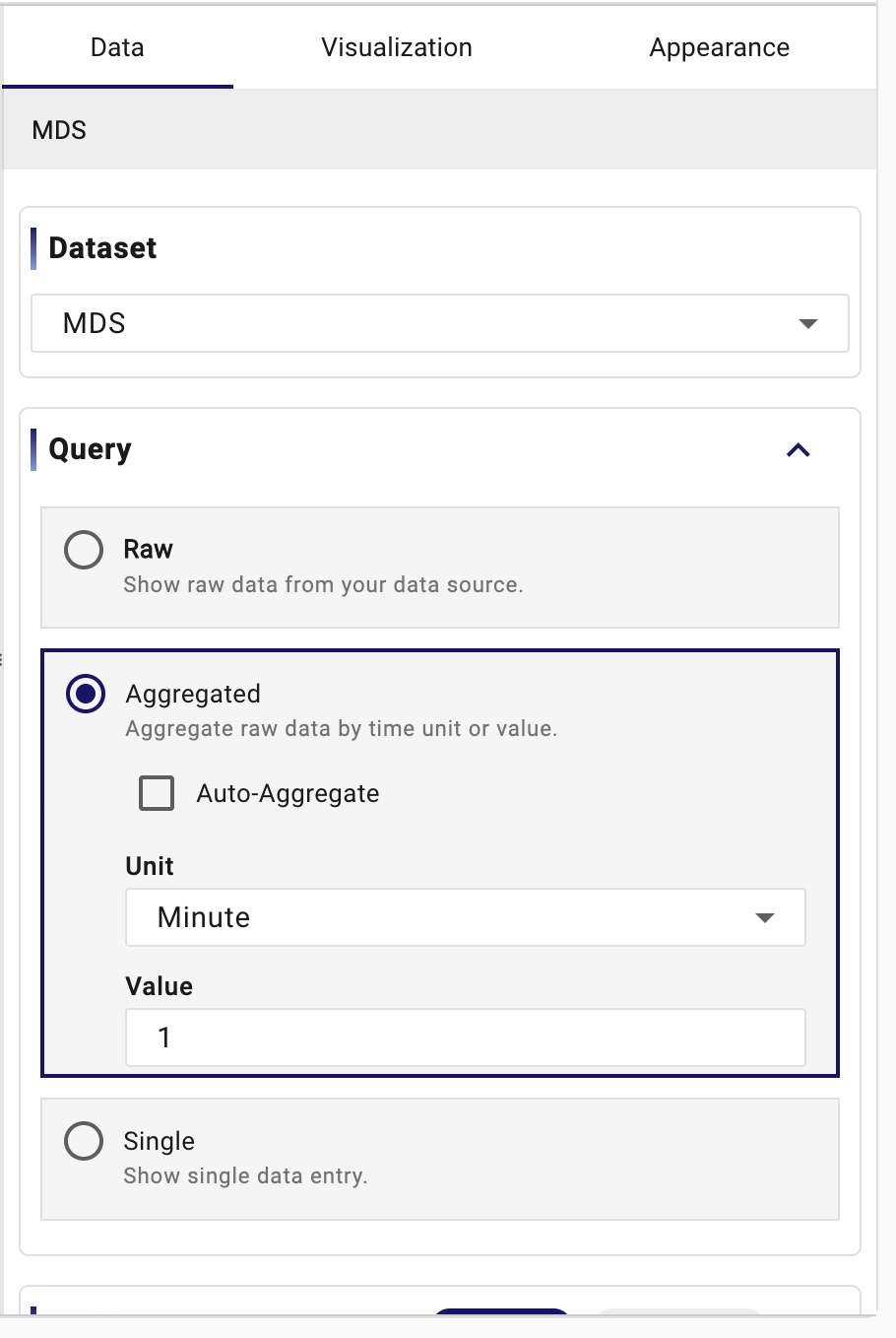
The first decision is the query type. StreamPipes currently supports Raw, Aggregated, and Single. These are not merely technical options. They describe three different ways of looking at data.
Raw is the right choice when exact event rows matter. If an engineer wants to inspect the last 200 machine events exactly as they were stored, raw mode is appropriate. In that mode, Limit and Page matter because you are thinking in rows. Raw mode is especially useful for troubleshooting, detailed tables, and charts where every original event should remain visible.
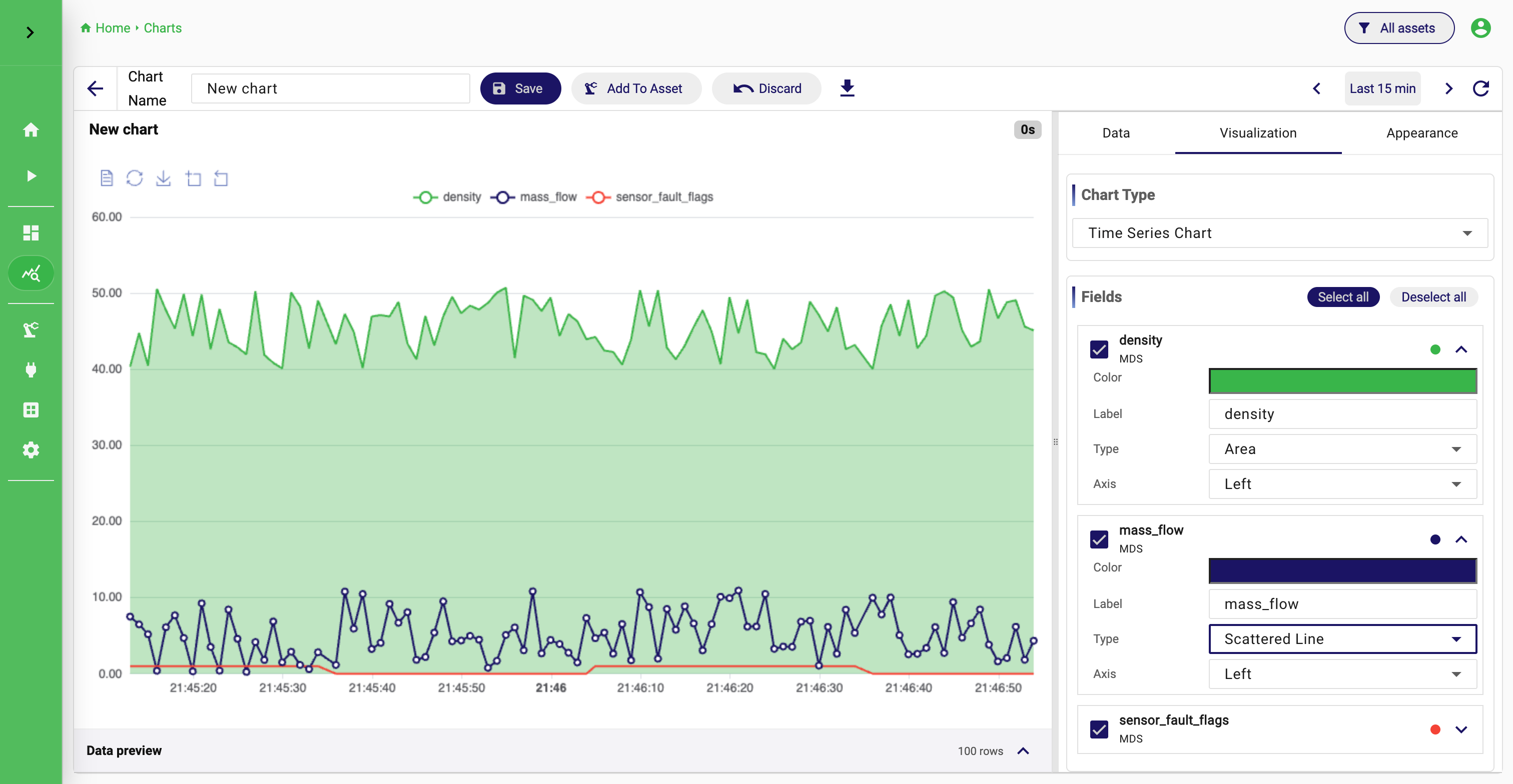
Aggregated is the right choice when the raw data is too dense or too noisy to be useful as-is. Industrial datasets often fall into this category. A vibration sensor or a rapidly sampled temperature stream can produce too many points for a meaningful multi-day chart. Aggregation solves that by summarizing the data. In the editor, you can let StreamPipes use Auto-Aggregate or disable it when you need explicit control. In practice, aggregation is often the mode that turns a technically correct chart into one that is actually readable.
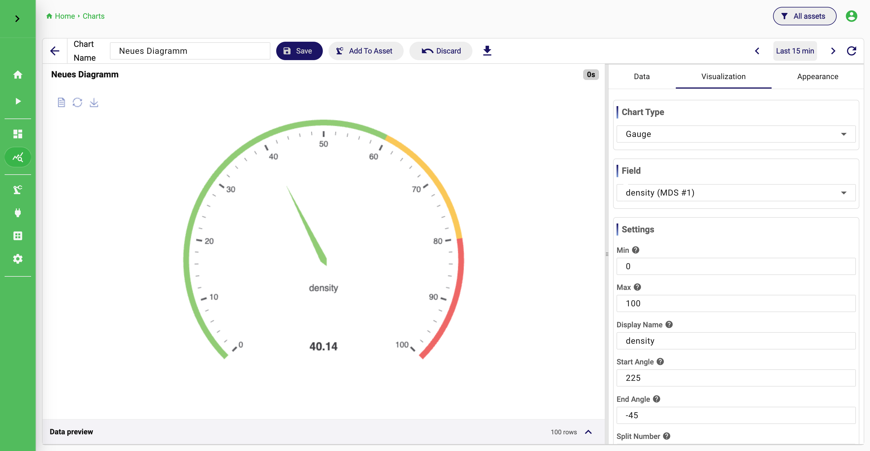
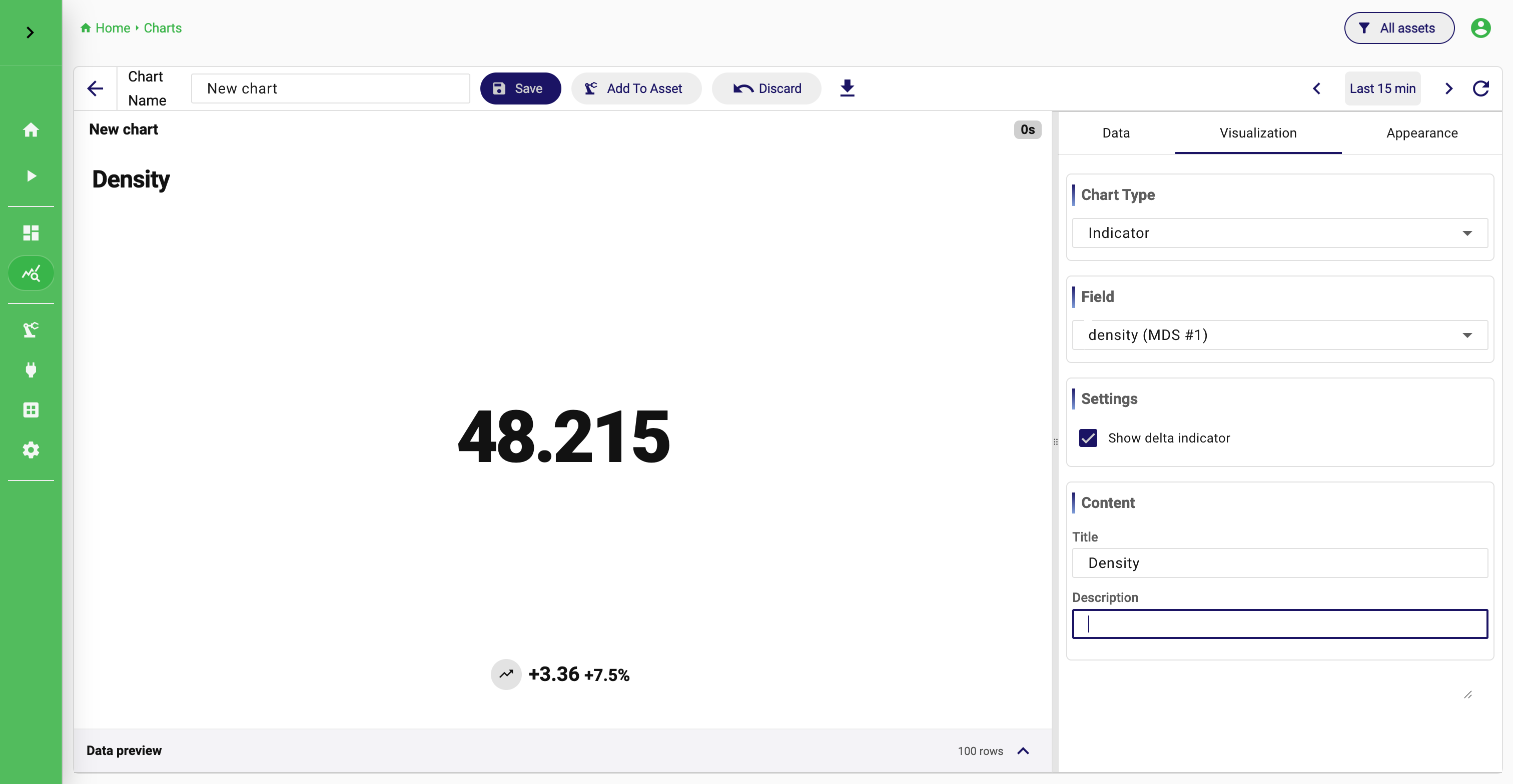
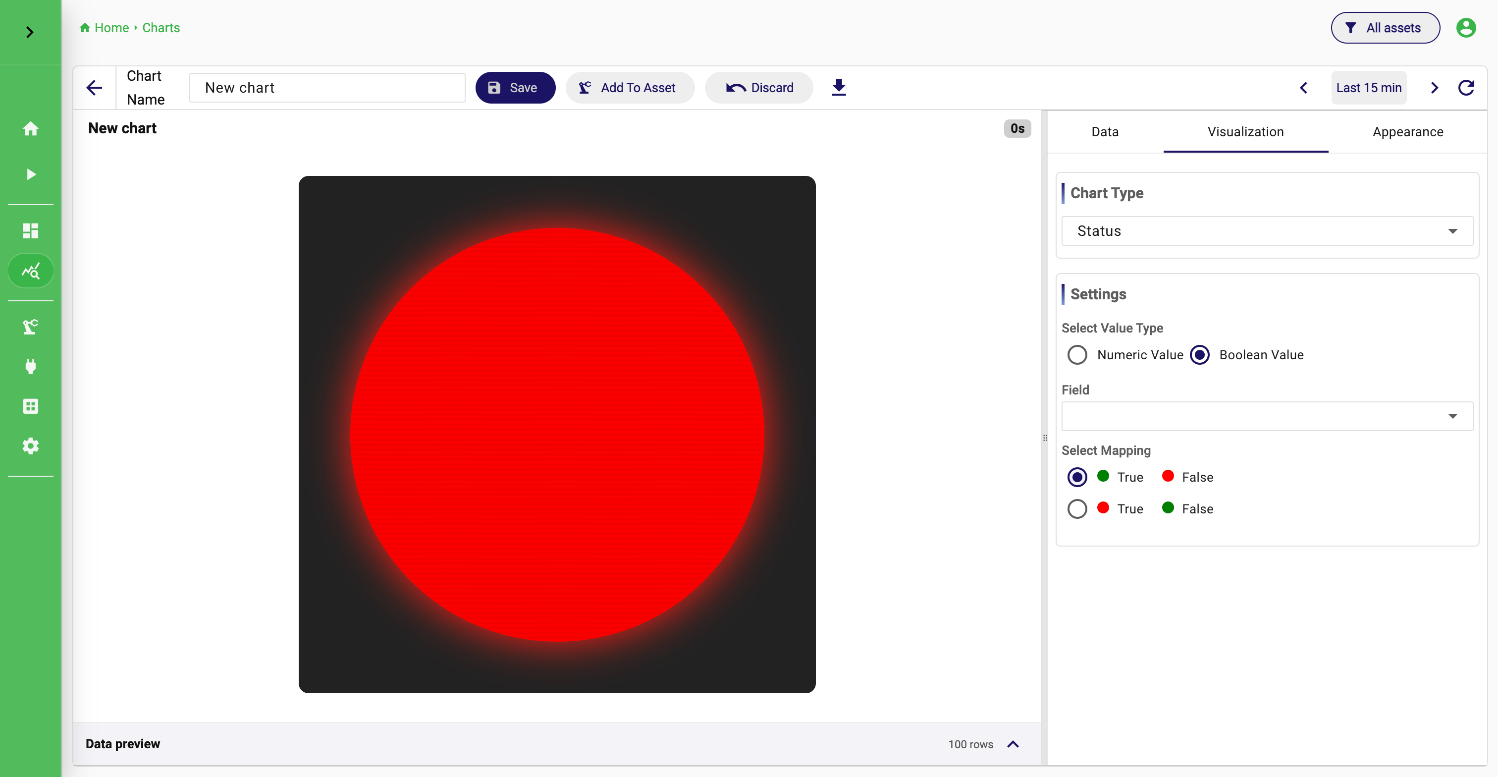
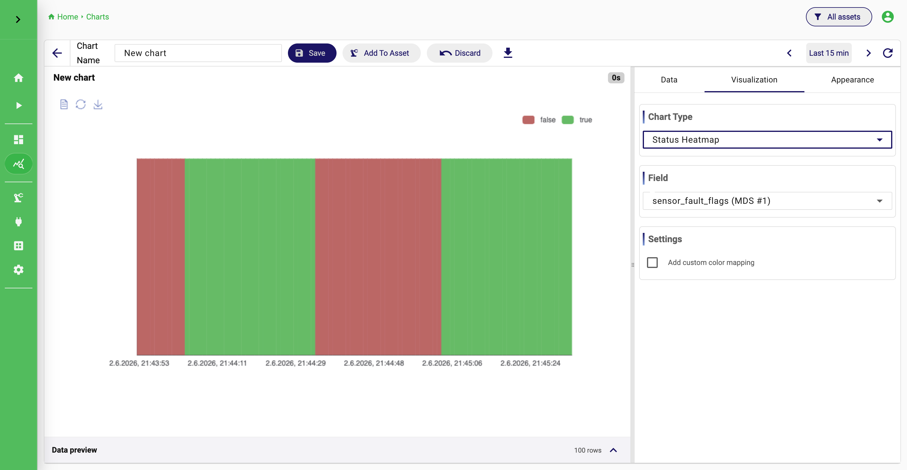
Single is the right choice when the chart should show one current state rather than a history. A gauge for current pressure, a status light for machine availability, or an indicator for current power draw are typical examples. In those cases, a time series would add noise instead of clarity.
Query Type
Refine the result with fields, filters, grouping, and order
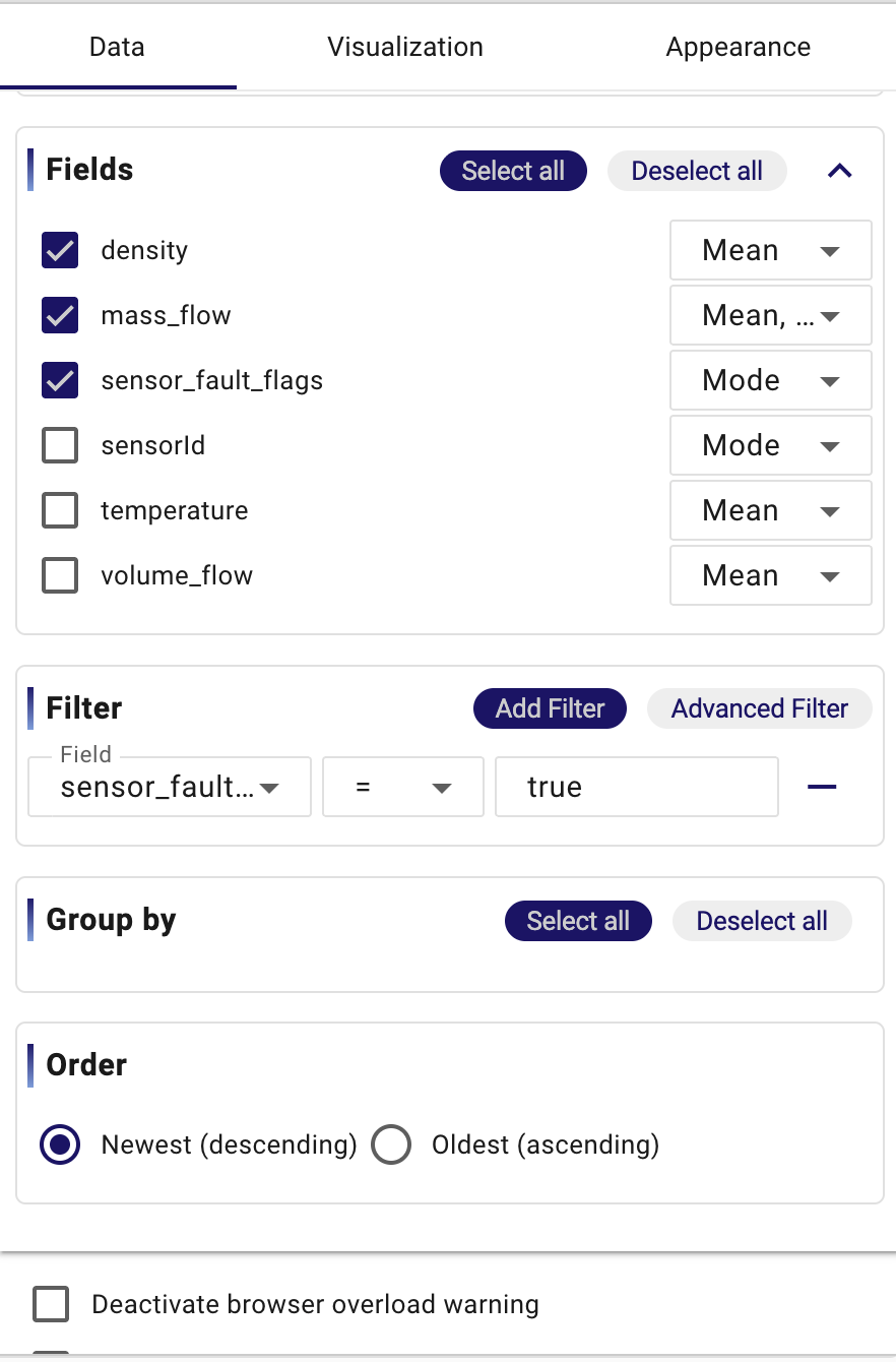
After choosing the query type, continue refining the result itself. StreamPipes loads the dataset fields and preselects an initial set to get you started. Keep in mind that field selection is not just cosmetic. It changes what the chart can work with.
In raw mode, selected fields are returned directly from the dataset. In aggregated or single mode, they take part in the summarization logic. A temperature field, for example, might become the basis for an average over time instead of a direct event-by-event series. That is why a good habit is to ask yourself: which fields are essential to answer the question, and which ones only add clutter? A troubleshooting table often benefits from several context fields. A focused time series often benefits from only the timestamp and one or two measurements.
Filters come next. This is where a broad operational dataset becomes a dataset for one clear question. If a dataset contains values from several machines, several lines, or several orders, filtering is usually the first thing that makes the chart intelligible. A simple filter is often enough: one machine identifier, one status, one threshold, one product type. The Advanced Filter dialog becomes useful when the logic grows more precise, for example when one chart should show alarms for a specific line only when a second condition is also true.
Grouping and ordering complete the query shape. Group by is what makes one dataset split into several visible series or buckets, for example one series per machine or one bucket per state. Order matters most when the chart or table should emphasize recency or chronology. If a user wants the newest alarms first, descending order is natural. If the goal is to reconstruct a process in the order it happened, ascending order is better.
At the bottom of the data configuration, StreamPipes also offers two small but practical switches: the browser overload warning and the missing-values option. These are not usually the main story of the chart, but they matter operationally. A large result set can make the browser heavy, and incomplete rows can distort multi-field charts. If a chart becomes unstable because one field is occasionally missing, ignoring incomplete events can be more useful than trying to style around the problem.
Build the Query First
Advanced Filter

Use the data preview as your checkpoint
The Data preview is one of the most important parts of the chart editor. It is the moment where the abstract query becomes visible as concrete rows. Users who learn to trust the preview usually build better charts faster.
Before spending time on chart type or appearance, look at the preview and ask a few basic questions. Did you select the correct dataset? Did the filter return the right subset? Did grouping create the result shape you expected? Does the result look like something the chosen chart type can represent well? Many chart problems are already obvious in the preview. If a pie chart seems wrong, the grouped values are often already wrong in the table. If a status chart looks confusing, the issue is often that the query still returns too many rows instead of one clear current state.
The three configuration tabs are easiest to understand as a sequence. Data defines what should be queried. Visualization decides how that result should be interpreted as a chart type. Appearance is where presentation details are refined once the analytical meaning is already correct.
Choose the chart type to match the question
Only after the query result looks right does it make sense to choose the visualization. The current chart registry includes Gauge, Table, Traffic Light, Status, Map, Time-Series Heatmap, Status Heatmap, Time Series Chart, Image, Indicator, Scatter, Histogram, Pie, and Value Distribution Heatmap.
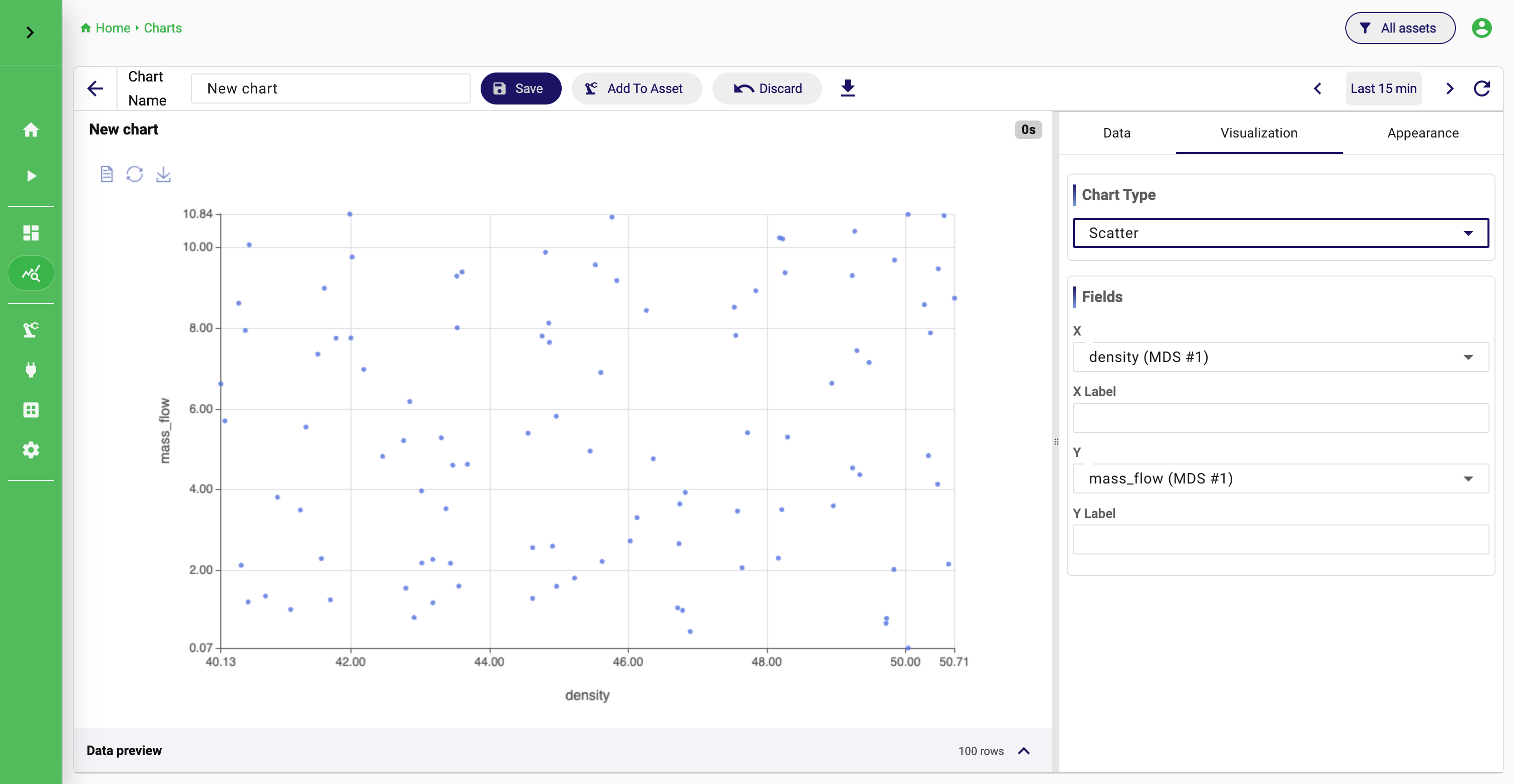
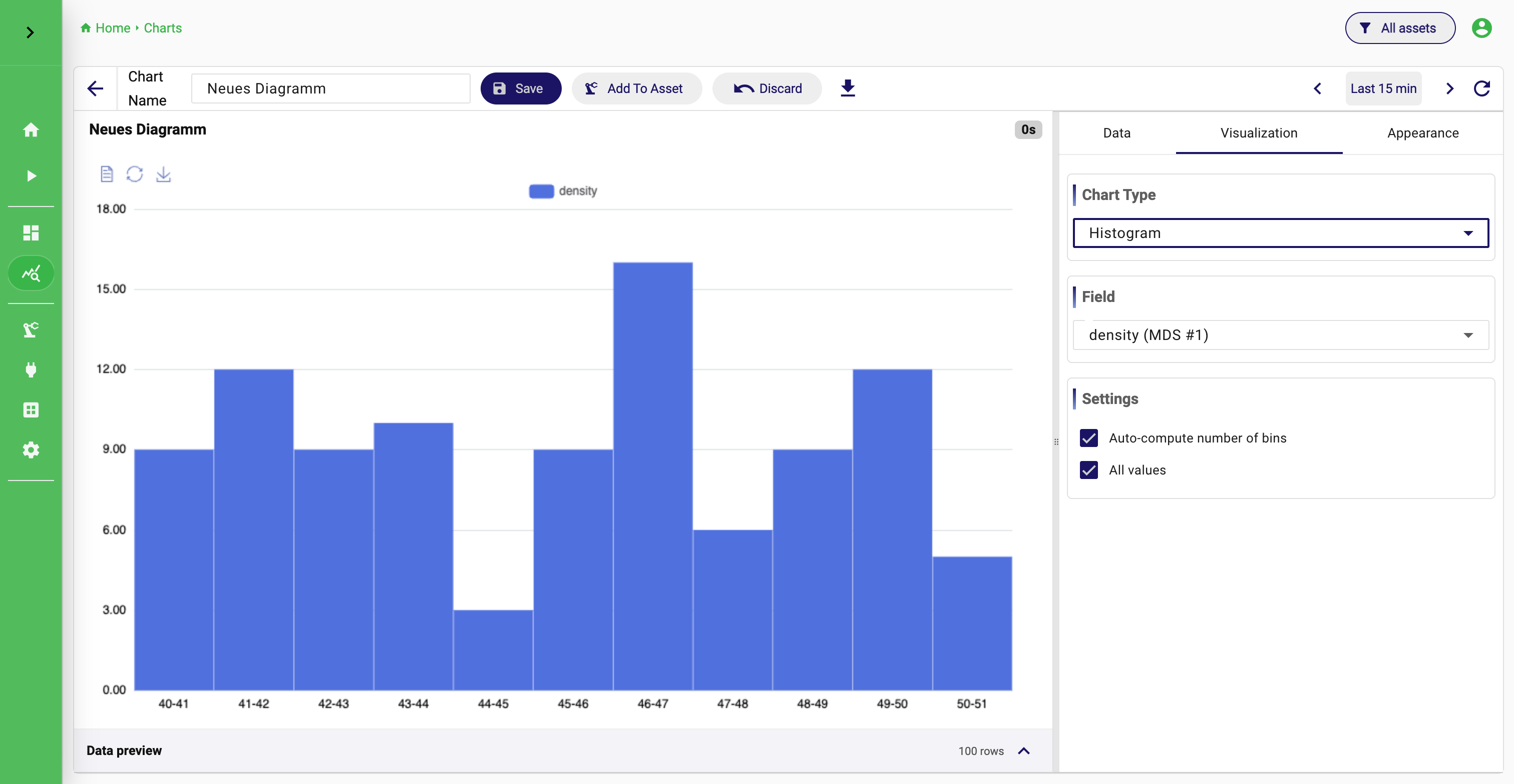
The simplest way to choose among them is not to memorize all options, but to think about the shape of the answer you need. A Time Series Chart is the natural choice when the main question is how values develop over time. Gauge, Indicator, Traffic Light, and Status are all good when the chart should communicate one current state quickly. A Table is better when the exact stored rows still matter more than visual summarization. Pie, Histogram, and Value Distribution Heatmap are better when the goal is to understand composition or distribution. Scatter is useful when two measurements should be compared on an x/y plane. Map only becomes useful when the dataset really contains meaningful spatial coordinates.
A few examples help. Machine temperature over the last eight hours is usually a Time Series Chart. Current tank fill level is a Gauge. Current compressed-air consumption as a KPI is an Indicator. The share of machine states during a shift is a Pie. The distribution of cycle times is a Histogram. The relationship between temperature and vibration is a Scatter plot. These are not hard rules, but they are reliable defaults.
Representative Chart Types
Finish the chart in visualization and appearance
After selecting the chart type, the designer panel lets you refine Visualization and Appearance. The exact controls depend on the selected chart type, but the conceptual split stays the same: Data decides what is returned, Visualization decides how that result is interpreted, and Appearance controls presentation such as titles, colors, and formatting.
This separation is worth keeping in mind because it prevents a common mistake. If the chart tells the wrong story, the problem is usually not in the appearance tab. It is usually in the query or in the chart type. Appearance should be the final polishing step, not the place where the analytical meaning is invented.
Time Selection
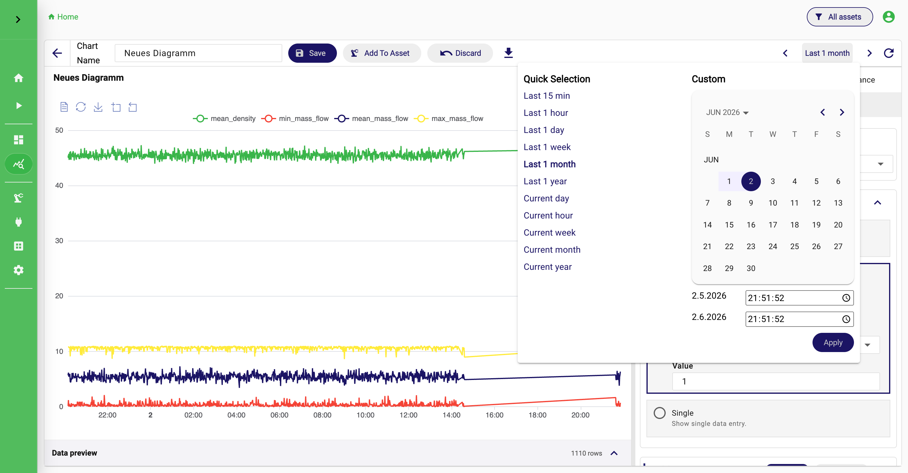
Time selection matters more than it first appears. A chart can be technically correct and still communicate the wrong thing when the active time range does not match the operational question. Short ranges are usually best for current monitoring and troubleshooting. Longer ranges are better when you want to understand trends, compare shifts, or inspect seasonal behavior. The custom date range is the right choice whenever the chart should focus on one exact incident window instead of a rolling relative interval.
Appearance Settings
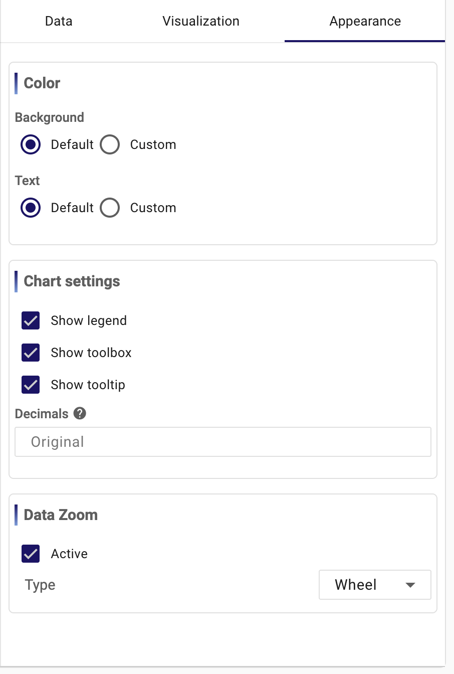
This is where a technically correct chart becomes easier to consume. Colors should support recognition rather than decoration. Legend, toolbox, and tooltip settings decide how much local guidance the viewer gets. Decimal formatting matters when values are either too noisy or not precise enough for the intended audience. Options such as zoom are useful when a chart is meant for exploration instead of only passive monitoring. The key is still the same: use these controls to improve readability, not to compensate for a weak query.
Save, reuse, and manage the chart
The chart toolbar is deliberately small, but every action there matters. You can edit the Chart Name, Save the chart, Add To Asset, Discard changes, Download data, and change the time range.
Save is what turns the current editor state into a reusable platform object. From that point on, the chart can be reopened, shared, linked to an asset, or added to a dashboard. Download data is useful when the query result should be validated outside StreamPipes or handed to someone else. Add To Asset matters when the chart belongs to a specific machine, line, or site and should be discoverable through the asset context.
Back in the overview, you can open the chart again, edit it, clone it, manage permissions, or delete it. Cloning is especially useful because it lets you reuse a proven chart structure for another machine, another filter, or another visualization variant without rebuilding it from scratch. Permissions matter when a chart should be visible only to a specific group or team but still remain reusable in dashboards.
How charts fit into the rest of StreamPipes
Charts are best treated as reusable analytical building blocks. A chart should answer one question well. A dashboard can then combine several of those answers into one operational view. That is why the recommended workflow is to build and validate the chart first, save it, and only then add it to one or more dashboards.
When users follow that approach, both features become easier to maintain. If one dashboard item looks wrong later, the place to fix it is often the source chart, not the dashboard itself.