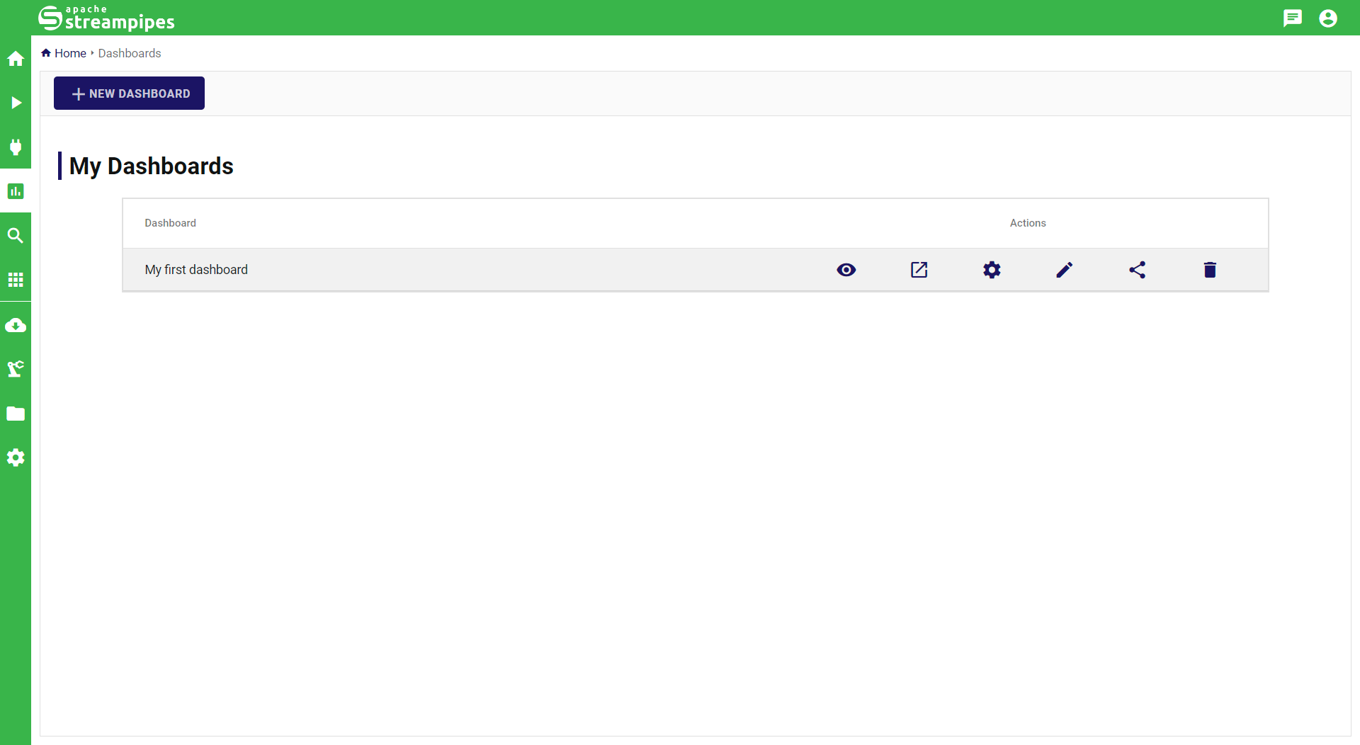
Live Dashboard
The live dashboard can be used to visualize live data of data streams using a set of visualizations The entry page of the live dashboard lists all created dashboards as in the screenshot below:
Visualizing Data Streams
To visualize data streams in the live dashboard, a pipeline must be created that makes use of the so-called Data Lake sink. Any data stream or data processor can serve as an input of the data lake sink. Switch to the pipeline editor, create a pipeline and configure the data lake sink. The visualization name is used to identify the sink in case multiple data lake sinks are used within a single pipeline.
Managing Dashboards
Multiple dashboards can be created, e.g., to organize different assets in a single dashboard view.
A new dashboard can be created by clicking the New Dashboard button, which opens a dialog that requires basic dashboard settings such as the title and description of the new dashboard. Once created, the dashboard will be shown in the overview. Here, the following dashboard actions are available:
- Show opens the dashboard.
- Window opens the dashboard in a new window with reduced controls, e.g., without the StreamPipes navigation and toolbar. This is a useful view for standalone displays that should visualize key parameters.
- Settings allows to modify the basic dashboard settings.
- Edit opens the dashboard in edit mode, where widgets can be added to the dashboard.
- Delete deletes the selected dashboard.
Creating Visualizations
Visualizations can be added to each dashboard in form of widgets. To add new visualizations, switch to the dashboard in Edit mode. In edit mode, a button appears that allows to add a new visualization.
Adding a new visualization is supported by a wizard consisting of three steps:
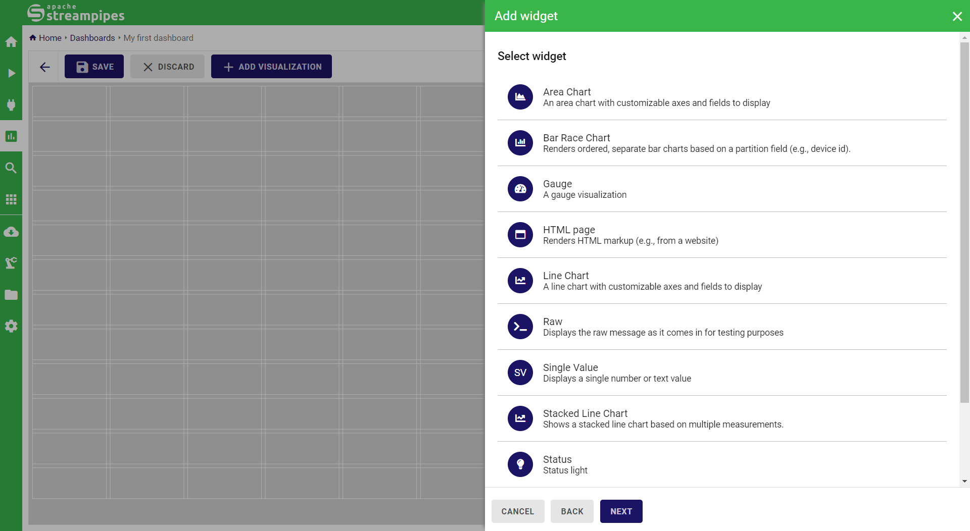
- Select pipeline is the first step where a pipeline is selected on which the visualization is based. In this view, all pipelines are listed that have at least one Dashboard Sink. In case a pipeline contains multiple data lake sinks, the visualization name is listed below the pipeline name which eases discovering of the proper visualization.
- Select widget is the next step where the visualization widget must be selected. StreamPipes automatically filters this list based on input requirements of widgets. For instance, image visualizations are only visible if the input data stream provides an image object.
- Configure widget provides widget-specific settings to configure the visualization. In most cases, colors and titles of widgets can be modified. Additionally, chart-specific settings such as axis value ranges can be configured.
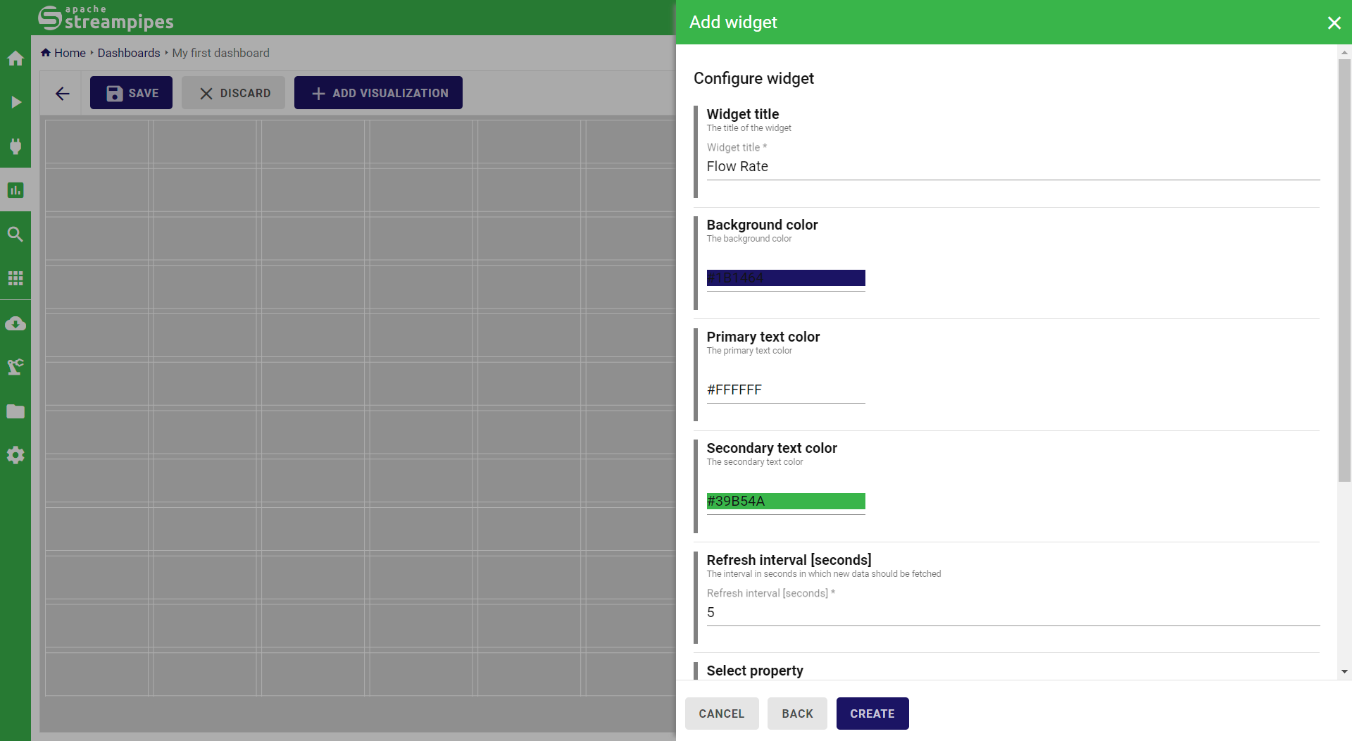
By clicking Create, the new widget is placed on the canvas. Size and positioning of visualizations can be flexibly changed based on the provided grid. To change the widget configuration, the Settings button of each widget can be clicked to re-open the configuration dialog.
Once created, the dashboard provides a live view of all visualizations:
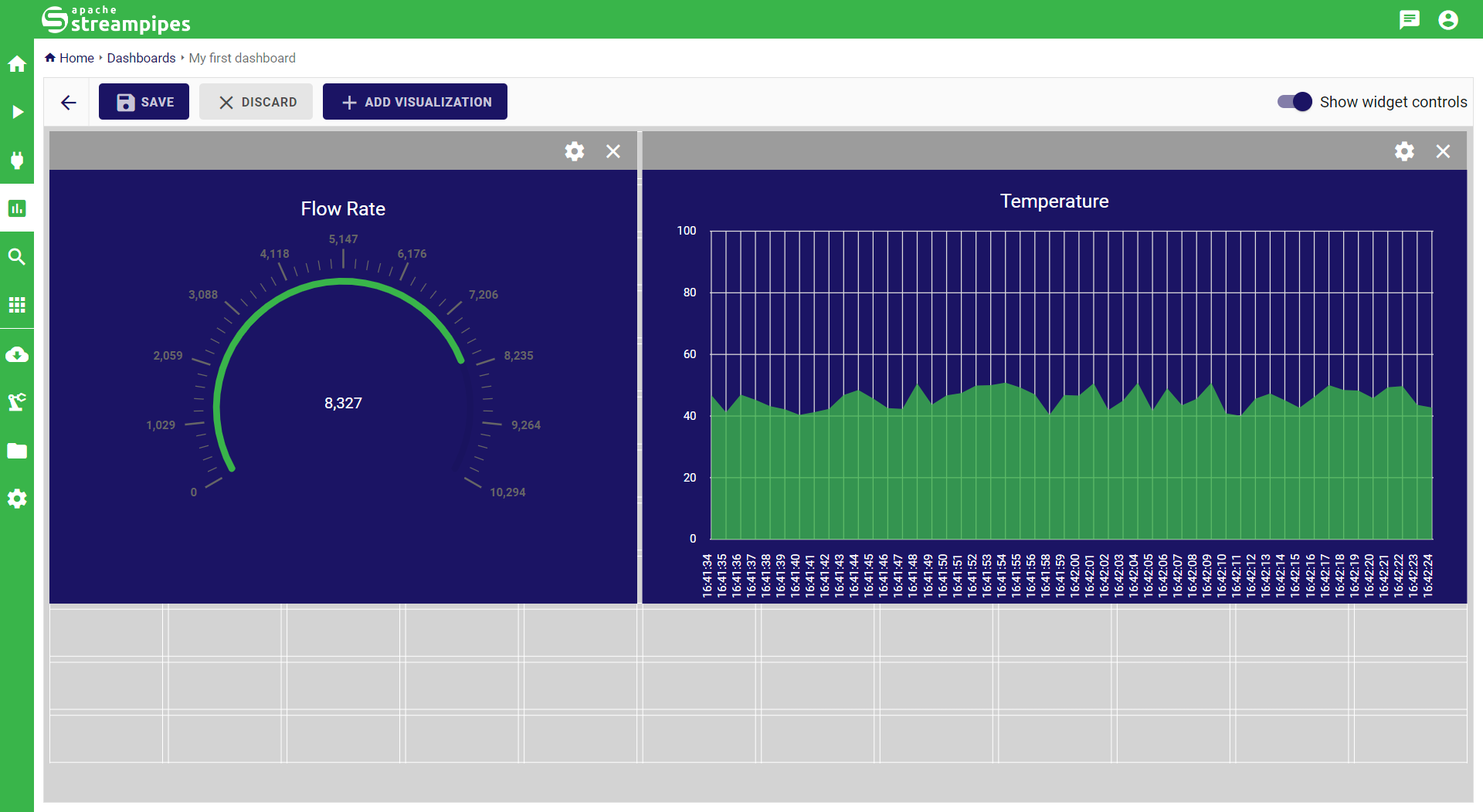
Before the dashboard is closed, make sure to click the Save button to persist the updated dashboard. Changes can be discarded by clicking the Discard button.
Available widgets
The following visualizations are available in the latest release:
- Area Chart
- Gauge
- HTML page (renders HTML markup)
- Image
- Line Chart
- Raw (displays the raw JSON input for debugging purposes)
- Single Value (displays a single measurement)
- Table
- Traffic Light